Morrison
Branding
“Being elastic means exploring all possibilities. It means having the flexibility to pivot to better ideas based on the most current data. It means coming from a place of yes and why not. But in order for that flexibility to have the strength to bend and not break, we’re always grounded and guided by strategy and structure. We believe that this approach allows us to adapt to changing circumstances, embrace new ideas, and approach challenges with a broader perspective.”
Tools
Photoshop
Illustrator
InDesign
After Effects
Sketch
Problem
Morrison had reimagined their mission system from being a challenger brand to being elastic and wanted new branding to go along with it.
Solution
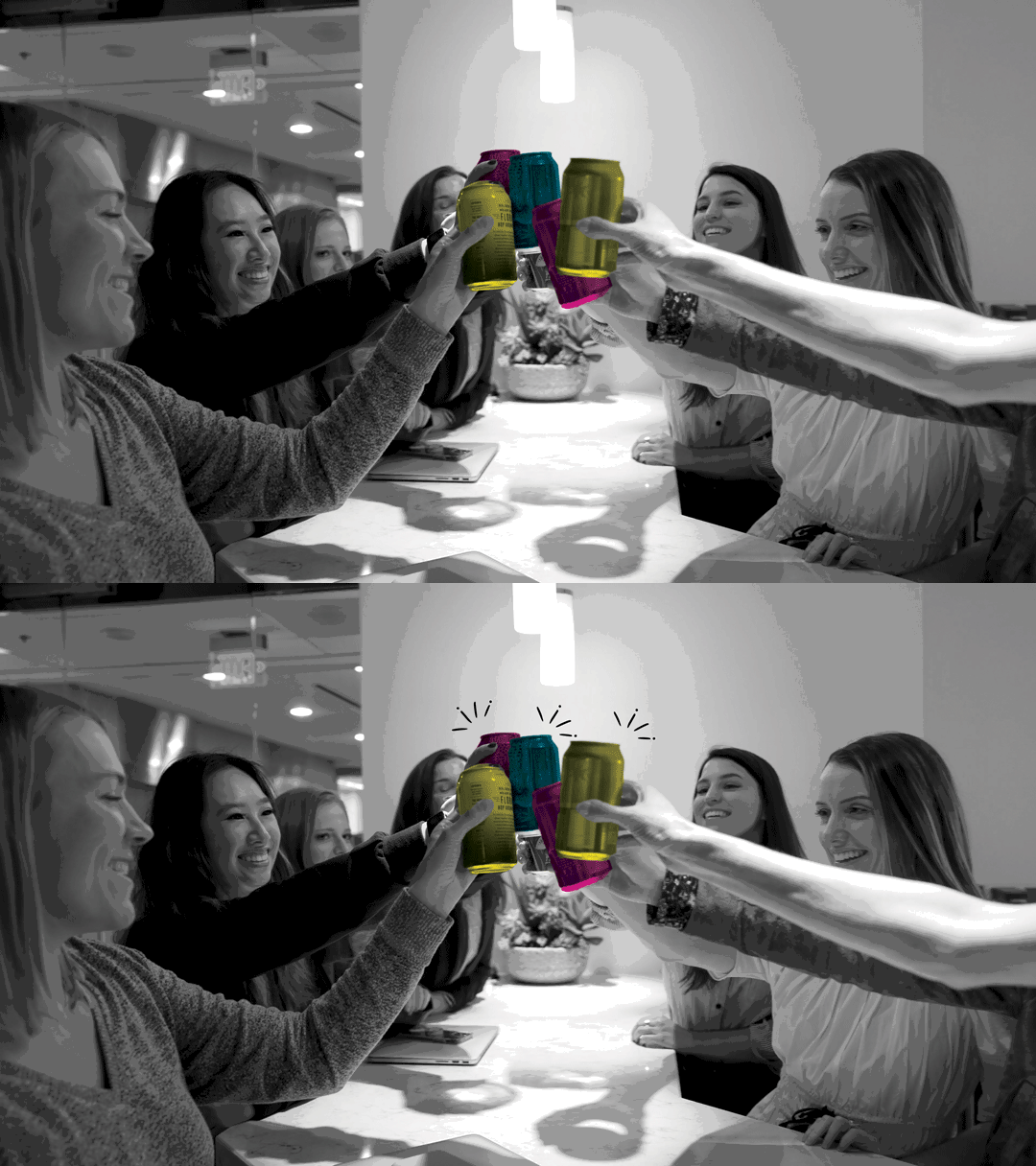
Reframing the idea of elasticity in terms of color theory, I decided to use CMYK as the foundation of the new brand identity system.


